

Types Of Charts Used In Technical Analysis And How To Interpret Them
- 3m•
- 3,274•
- 14 Aug 2023
Technical charts help traders take an informed decision while making a financial commitment in the markets. They are a graphical representation of historical price, volume, and time intervals. Over the years, several researches have co-related chart with technical tools like moving average, trendlines, and technical indicators.
Types Of Charts
The main chart types used by most traders are the Line Chart, Candlestick Chart, Renko Chart, and Point and Figure charts. These charts are plotted either on arithmetic or logarithmic scale and the analyst then chooses either depending on the information required.
Line Charts
This form represents price in a line format. The closing price points are considered to draw a line chart which together form something akin to ECG pattern, and the information revealed is very concrete. As the closing price is considered as the strongest move of the price, the direction of the line (upside or downside) assists in identifying the underneath strength.
In a few cases, various chart formations like Head and Shoulder, Double Top, Channel pattern are viewed on a closing basis.
Candlestick Charts
This chart represents price in the structure of High, Low, Open, and Close price. All the four information is charted in the form of a candle. The area from the open price to high is called as 'upper shadow', the level from close to low is named as 'lower shadow' and the region between open and close is the 'body'.
The candlesticks formed may differ as price changes on a day-to-day basis. There are various candlesticks, the most common are: Bullish Candle, Bearish Candle, Barbuzzo candle, Doji, Hammer, Inverted Hammer, Hanging man, Harami, Shooting star
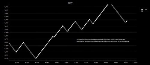
Renko chart
This kind of chart explains price movement in a simple way. Two boxes are considered, wherein an up move is denoted by a white box and down move by an empty box. A box is formed only after the price change meets a certain criteria. This format focuses solely on price movement and does not consider volume or time frame. It does not reflect the exact high and low price either. The basic idea is to filter out noise and determine the trend strength by the rise and fall in price.
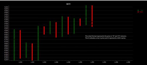
Point and Figure charts
This chart format represents price in 'X' and 'O' columns. The 'X' indicates a rise in price and 'O' represents a fall in price. The idea is to filter out the noise and lag that is formed during heavy swings in the market. Each column shows a value that the price should reach to form the next 'X' or 'O' symbol. Here, time and volume has no relevance. It's the price strength that determines the value of a trend. The formation of 'X' or 'O' may remain stagnant till a major move is ascertained. This also assists in identifying support and resistance areas.
Popular Stocks
| Stock Name | Market Price | ||||||||
|---|---|---|---|---|---|---|---|---|---|
- | |||||||||
- | |||||||||
- | |||||||||
- | |||||||||
- | |||||||||
- | |||||||||
- | |||||||||
- | |||||||||
- | |||||||||
- | |||||||||
Check Share Market Today | |||||||||


