

How To Read Stock Charts?
- 5m•
- 5,800•
- 18 Aug 2023
Candlestick, bar, line and point and figure charts – we are now aware of the different types of charts used for technical analysis of stocks. In this article, we will review these charts in greater depth and understand the various patterns that are used for understanding stock charts.
Read about approaches to select stocks here
Essentials For Interpretation
Technical analysis is all about interpreting stock price movement and trade volumes. Information about these is widely available. However, it needs to be converted into a form that can be easily understood and used for trading.
In technical analysis, this process begins with the construction of stock price charts. After this, you need to interpret these charts. You may use tools like momentum indicators, chart patterns and trend lines for this. We have taken a look at these tools in previous sections.
In this section, we will explore some chart patterns that are used for interpreting these charts.
Read here about dividend yield stocks
Understanding Stock Charts
The next logical step after learning how to construct technical charts is understanding these stock charts. In this segment, we will review some basic stock chart patterns that are used for stock chart analysis and drawing important conclusions. Chart patterns are divided into reversal patterns and continuation patterns. Note that these patterns can be used for all types of charts, except for point and figure charts.
Click here to read about evaluating a buyback offer
-
Reversal patterns:
Reversal patterns indicate that the present trend of price movements is going to reverse. In other words, if the price of a stock is currently increasing, it will start falling and if it is decreasing, it will start rising. There are two important reversal patterns:
- Head and shoulders and inverse head and shoulders: The head and shoulders pattern is created when three consecutive waves appear on a stock price chart. It has been illustrated below. Look at how the middle wave has a higher peak than the other two. It is therefore called the head. The other two are known as the left and the right shoulder respectively. A head and shoulders pattern normally forms after a strong upward pattern. The peak of the first (left) shoulder is higher than that of the rally that preceded it. It is marked by very high market volumes. The fall that follows this is sharp and takes the price close to the point from where the shoulder began. It is marked by low volumes. The next move in the pattern is the creation of a head by another, bigger up-move. It is again marked by low volumes. This move is followed by another fall that takes the price back to where it rose from on the last two occasions. It is called the neckline. The third move is the creation of the left shoulder and a subsequent collapse. Thereon, the price doesn’t rise and a long term price fall starts. In other words, the reversal sets in.
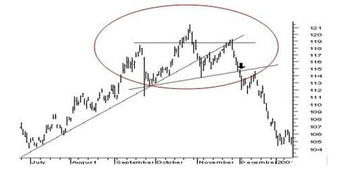
Head and Shoulders Pattern
The price target for the reversal, i.e., the price at which the fall will end is given by the following formula:
Price target = Neckline price - (Price at the head – Neckline price)
OR
Price target = Neckline price – Price at the head + Neckline price
The head and shoulder patterns marks the reversal of an uptrend. However, being a reversal pattern, it should also mark the reversal of a downtrend, i.e. the end of a period of constantly falling prices. Such a reversal is indicated by the head and shoulders pattern when it is formed in an upside down fashion. It is then called the inverse head and shoulders pattern. It is exactly the image of a head and shoulders pattern in water. In this case, there are three inverse waves, with the middle one, having the lowest bottom. It is displayed below using an illustration. It announces the coming in a period of rising stock prices.
Inverse Head and Shoulders Pattern
- Double tops and double bottoms: A double top also occurs after a significant uptrend. However, it contains two waves instead of three. Unlike head and shoulders, the price at both the peaks is the same. Larger the duration and the fall between the two waves, larger will be the fall when the trend eventually reverses. The formula for calculating target price in the case of double tops is the same as the one for head and shoulders. Following is a figure of the double tops pattern:
-
Double Tops Pattern:
A version of the double top pattern is also used to mark the reversal of a down trend. It is called the double bottom pattern. It follows a spell of constantly falling prices and looks like a water-image of the double top pattern. Following is a figure of the double bottoms pattern:
-
Double Bottoms Pattern:
Another variant of the double tops and bottoms pattern is the triple tops and triple bottoms pattern. It looks similar to the head and shoulders pattern, but instead of shoulders, it just has three heads. In other words, the shape of the peak and all three waves is roughly the same.
Read here about things you should keep in mind while reading stock recommendations
-
Continuation patterns:
Continuation patterns offer confirmation that the trend that was reflected by a stock chart before the emergence of the pattern will continue in future. So if the price was heading higher, it will continue to do so. If it was heading lower, again, it will continue to do so. Three continuation patterns are common:
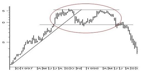
- Triangle Pattern: A triangle pattern is formed when the difference between the tops and bottoms on a stock chart is constantly reducing. As a result, if trend lines are inserted for tops and bottoms respectively, they will converge. This will give the pattern the appearance of a triangle. The difference between tops and bottoms reduces because of one of three reasons- bottoms are increasing while the tops are constant, tops are falling while the bottoms are constant and; both tops and bottoms are converging. These patterns lead to ascending, descending and symmetrical triangles respectively. All these trends indicate the continuation of the current trend in a technical chart.
In an ascending triangle, highs are constant, but the lows are increasing. Increasing lows means that investors are interested in buying the stock despite the high price. This means prices could move up further as more and more investors buy. The trend therefore, is the same as it was before the pattern emerged. Similarly, in a descending triangle, tops fall while bottoms are constant. This means investors are not interested in the stock despite its falling price. This indicates a further fall in prices as selling increases but there is little buying. In a symmetrical pattern, tops keep falling and bottoms keep increasing. This means existing sellers are keen on selling and existing buyers on buying more. Eventually, the two arrive at a consensus price. From thereon, prices continue heading in the same direction as before the emergence of the pattern. The figure of a symmetrical triangle is given below:
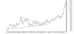
Symmetrical Triangle Pattern
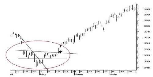
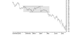
- Rectangle Pattern:
A rectangular pattern is formed when a stock’s price has been moving within a range. Every up-move ends at the same top and every down-move ends at the same bottom. In other words, there is no change in the top and bottom prices for a long period of time. If you construct a channel, you will find that the resulting trend lines are parallel. Together, they give the appearance of a rectangle. This signifies that investors are constantly buying the stock at a specific price and then constantly selling it at another specific price. This leads to the formation of clear support and resistance levels. Since neither buyers nor sellers of the stock are able to make up their minds about its price, the stock chart will continue heading in the same direction as before. A rectangle that appears after a long bull run is called a bullish triangle. It indicates a continued upward momentum. A rectangle that appears after a long bear run is called a bearish triangle. It indicates a continued downward momentum. The figure of such a triangle is given below:
Bearish Triangle Pattern
- Flags And Pennants: Flags and pennants are similar to rectangles and triangles respectively. However, they are only noticeable over a shorter period of time. Rectangles and triangles are usually noticed in technical charts for long durations. They also bring about long-term price changes. Flags and pennants, in contrast, are noticed only in intraday charts, usually over a week to ten days period. A flag formation is yielded by two parallel trend lines, caused by tops and bottoms that are increasing/ decreasing at the same rate. A flag formation usually occurs in the opposite direction as the current chart trend. For example, if the price has increased in the lead up to the formation, the parallel flag formation will trend downwards. However, it will indicate a continuation of the upward pattern, just as before. If the price has trended downwards, the flag will be upward-bound. However, it will indicate a continuation of the downward trend in the intraday chart. Pennants are almost identical to triangles. The only difference is that triangles advise about the continuation of long term trends, while pennants advise about short term trends.
Popular Stocks
| Stock Name | Market Price | ||||||||
|---|---|---|---|---|---|---|---|---|---|
- | |||||||||
- | |||||||||
- | |||||||||
- | |||||||||
- | |||||||||
- | |||||||||
- | |||||||||
- | |||||||||
- | |||||||||
- | |||||||||
Check Share Market Today | |||||||||


