

A Dummies Guide To Candlestick Charts
- 4m•
- 1,620•
- 21 Apr 2023
Candlestick charts are effective tools that give visual cues for technical analysis of stocks. These visualizations help in an easier interpretation of the stock’s price actions. A candlestick chart provides much more clarity than a line chart. Therefore, it is useful for analysing investor sentiment. Direct stock investors can use these chart interpretations to analyse patterns that regularly appear to forecast short-term stock price movements.
Here are a few key points; you need to know while reading candlestick charts:
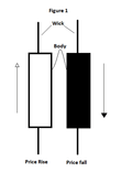
The Wick
Wicks or Candlestick shadows are the thinner lines in the above figure (Figure 1) which are indicative of intraday highs and lows. The length of the wick shows the up and down price movement of the candlestick body for the specified period. For example, if you wish to see the daily price movement of a particular stock for a period of one month, you can set your chart in such a way that one candlestick corresponds to one day. Therefore, you can see daily price fluctuations through the wick.

The Body
The body of the candlestick or the cylindrical shapes represents the open-to-close price range. You can colour-code the candlestick body in terms of price movements or market components (buyers and sellers). In Figure, the body is colour-coded to reflect price movements. The white body and the black body is representing price rise and price fall, respectively. The body shows the difference between the market opening and the closing price for the corresponding period. The size of the candlestick body can move both, up and down, and its shape changes to reflect price movements. These candlestick patterns are discussed in the next point.
Related read: 4 Things to Know About Mark to Market
The Patterns
The body and the wick of the candlestick together will help you analyse the pattern and level of volatility. The price movements form several patterns. These patterns might be bullish or bearish. Some of the notable bullish patterns are, hammer, inverse hammer, bullish engulfing, piercing line, the morning star, and three white sounders. Similarly, hanging man, shooting star, bearish engulfing, evening star, dark cloud cover and three black cows are some of the common bearish patterns. Apart from these, there are continuation candlesticks, for example, doji, spinning top, falling three methods, and rising three methods. One of the easy ways to read candlestick patterns is by managing your trade entry and exit according to the patterns the present.
Related read: 5 Things To Do When Markets Turn Volatile
One Related Number : 60%
On September 17, 2019, 60% of the Nifty50 constituent companies registered the formation of a ‘death cross’ on the daily candlestick charts. This represents the potential for a major sell-off by the investors. The death cross is a technical chart pattern formed when the short-term moving average crosses below its long-term moving average. It is a bearish signal and the investors are advised to stay cautious about the concerned stock price since the trend appears to be downside.


