

Understanding Technical Stock Charts & Their Types

Technical analysis is all about getting the price right. It even plots market trends using stock prices. All this action, though, happens in a place called ‘stock chart’.
Analysis of market trends is the first tool that is used in technical analysis of stocks. However, trend analysis cannot be done unless historical stock charts are available. This is because trends are discovered in the charts themselves. It is therefore critical to understand what a stock chart is and how to perform stock chart analysis to excel at technical analysis.
What Are Stock Charts?
As discussed earlier, performing technical analysis without using stock charts is like building a house without identifying a piece of land It is impossible. So, it is important to understand how to read charts. But before that, let’s try to answer a basic question, what is a stock chart?
Simply put, it is a graphical representation of how a stock’s price or trading volume has changed over time. This relationship can be presented in a number of ways, through the use of different types of charts. It is your job, as a technical analyst, to identify the type that will bring out a hidden trend most effectively.
Stock charts, like all charts, have two axes. The horizontal axis represents historical time periods, while the vertical axis displays the stock price or the trading volume corresponding to each period.
There are many types of charts that are used for technical analysis. A few common types are line chart, bar chart, point and figure chart, and candlestick chart.


What Are Trendline and Trend Length?
Now that you are familiar with the different types of charts, the next thing you want to understand is how to read them. Before doing so, though, it is important to understand trend lines and trend lengths —the principal tools used for the analysis of technical charts:
-
Trend Lines:
A trend line is a straight line that connects all the tops or bottoms in stock charts with each other. These lines are essential because trends are sometimes not so-clearly visible in technical charts. And the appearance of zigzag patches only makes stock analysis tricky.
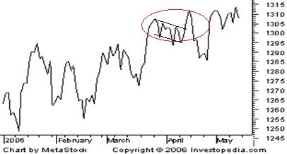
To reduce this distortion, an external aid has to be used. Take the example of the line chart shown earlier. It has been reproduced below with a few additional touches. Look at the section that has been highlighted. At the outset, there is no clear reason to say whether the price trend is going upwards or downwards. Tops and bottoms in this section do not clearly indicate whether they are going higher or lower. How, then, will you go about your chart analysis here? Using trend lines may prove helpful as they may be able to cut through the confusion here.
Since trend lines are straight lines, they smooth out the ‘waviness’ in the charts and accentuate the trends hidden in the stock chart. For the above chart, two trend lines have been used – one each for tops and bottoms respectively. The use of trend lines in a combination like this is called a channel. It helps you understand whether the trend is upwards or downwards. A stable uptrend, for example, is marked not only by increasing tops but also increasing bottoms. By using a single trend line, you will only be able to comment about one of these. To spot a trend, you must use a combination of trend lines. In other words, draw a channel.
-
Trend Length:
When analysing technical charts, it is important to not only spot trends but also predict the length of these trends. Primary trends are the longest lasting and bring about the most radical movement in stock prices. A decisive move in a stock price for a sustained period will only come if the trend is strong and enduring. Minor trends, and in some cases even secondary trends, are unable to cause such a meaningful impact. They may cause only a fleeting change. The longevity of a stock trend can be predicted by using patterns in the charts. You can begin by analysing trend lines. If trend lines suggest that each time the stock price rises to a higher level before falling, it is suggestive of an uptrend. However, the trend is confirmed only if simultaneously, the falls are also smaller. Some of the other measures to assess the longevity and conviction in technical charts are head and shoulders, inverse head and shoulders and, double tops and double bottoms.
What Are the Different Types of Charts?
-
Line Charts:
The line chart has the stock price or trading volume information on the vertical or y-axis and the corresponding period on the horizontal or x-axis. Trading volumes refer to the number of stocks of a company that were bought and sold in the market on a particular day. The closing stock price is commonly used for the construction of a line chart.
Once the two axes have been labelled, preparation of a line chart is a two-step process. In the first step, you take a particular date and plot the closing stock price as of that date on the graph. For this, you’ll put a dot on the chart in such a way that it is above the concerned date and alongside the corresponding stock price.
Let’s suppose that the closing stock price on December 31, 2014, was Rs 120. For plotting it, you’ll put a dot in such a way that it is simultaneously above the marking for that date on the x-axis, and alongside the mark that says Rs 120 on the y-axis. You will do this for all dates. In the second step, you will connect all the dots plotted with a line.
-
Bar Charts:
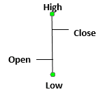
A bar chart is similar to a line chart. However, it is much more informative. Instead of a dot, each marking on a bar chart is in the shape of a vertical line with two horizontal lines protruding out of it, on either side. The top end of each vertical line signifies the highest price the stock traded at during a day while the bottom point signifies the lowest price at which it traded at during a day. The horizontal line to the left signifies the price at which the stock opened the trading day. The one on the right signifies the price at which it closed the trading day. As such, each mark on a bar chart tells you four things. An illustration of the marks used on a bar chart is given below:
A bar chart is more advantageous than a line chart because in addition to prices, it also reflects price volatility. Charts that show what kind of trading happened that day are called intraday charts. The longer a line is, the higher is the difference between opening and closing prices. This means higher volatility.
-
Candlestick Charts:
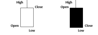
Candlestick charts give the same information as bar charts. They only offer it in a better way. Like a bar chart is made up of different vertical lines, a candlestick chart is made up of rectangular blocks with lines coming out of it on both sides. The line at the upper end signifies the day’s highest trading price. The line at the lower end signifies the day’s lowest trading price. The day’s trading can be shown in intraday charts. As for the block itself (called the body), the upper and the lower ends signify the day’s opening and closing price. The one that is higher of the two is at the top, while the other one is at the bottom of the body.
What makes candlestick charts an improvement over bar charts is that they give information about volatility throughout the period under consideration. Bar charts only display volatility that occurs within each trading day. Candles on a candlestick chart are of two shades – light and dark. On days when the opening price was greater than the closing price, they are of a lighter shade (normally white). On days when the closing price was higher than the opening price, they are of a darker shade (normally black). A single day’s trading is represented by intraday charts. Higher the variation in colour, more volatile was the price during the period. The appearance of candles on a candlestick chart is as follows:
-
Point and Figure Charts:
A point and figure chart bears no resemblance with the other three kinds of charts discussed above. It was used extensively before the introduction of computers for stock analysis. These days, however, it is used by a very limited number of people. This is chiefly because it is complex to understand and provides limited information. A point and figure chart essentially displays the volatility in a stock’s price over a chosen period of time. On the vertical axis, it displays the number of times stock prices rose or fell to a particular extent. On the horizontal axis, it marks time intervals. Markings on the chart are exclusively in the form of Xs and Os. Xs represent the number of times the stock rose by the specified limit, while Os represent the number of times it fell by it. The specified amount used is called box size. It is directly related to the difference between markings on the y-axis.
-
Heikin-Ashi Charts:
Heikin-Ashi charts are a modified form of candlestick charts. They use a special averaging technique to smooth out price data, making trends easier to spot. These charts are particularly useful for identifying trend direction and strength, as they reduce market noise and highlight the dominant trend. Traders often use Heikin-Ashi charts in conjunction with other types for a more accurate analysis.
The primary advantage of Heikin-Ashi charts lies in their ability to filter out the noise that can obscure true market trends. By averaging the data, these charts produce a series of candlesticks that are less erratic, allowing traders to focus on the dominant trend. This simplification is especially beneficial in volatile markets where frequent price fluctuations can lead to misleading signals.
Traders often pair Heikin-Ashi charts with other types of analysis for a more comprehensive view. For instance, combining them with traditional candlestick patterns or indicators like moving averages can enhance accuracy in predicting price movements. The clear visual representation of trends provided by Heikin-Ashi charts enables traders to make informed decisions, such as when to enter or exit positions, with greater confidence.
-
Renko Charts
Renko charts give price movement information, just like candlestick charts. But they display it differently. Instead of showing price action every time, Renko charts focus only on significant price changes. Time is not a factor in building a Renko chart — only price movement matters.
Renko charts are made up of bricks or blocks, which are all equal in size. A new brick is added only when the price moves up or down by a fixed amount. If the price moves in the same direction by that set value, a new brick continues in that direction. If the price moves in the opposite direction, the brick shifts to the other side.
Each brick shows a clear uptrend or downtrend. Upward bricks are usually shown in white or green, and downward bricks in black or red. Because of this, trends become much easier to spot. Renko charts are useful for identifying support and resistance levels, filtering out market noise, and staying focused on long-term trends.
What makes Renko charts different from candlestick charts is that they ignore small, insignificant price changes. This helps traders avoid confusion caused by short-term volatility. The appearance of a Renko chart is clean, simple, and trend-focused, making it a useful tool for intraday as well as positional traders.
Types of Stock Chart Patterns
Stock chart patterns play a crucial role in technical analysis of the financial markets. These patterns help traders predict future price movements based on historical data. Some of the most important patterns include head and shoulders, double tops and bottoms, triangles, and flags. While each pattern tells a unique story, they all serve to inform traders about potential market direction.
-
Head and Shoulders
The head and shoulders pattern is one of the most reliable indicators of a trend reversal. It consists of three peaks: a higher peak (head) flanked by two lower peaks (shoulders). When this pattern forms during an uptrend, it often signals a bearish reversal, suggesting that prices may fall. Conversely, an inverted head and shoulders pattern during a downtrend signals a potential bullish reversal.
-
Double Tops and Bottoms
Double top and bottom patterns indicate potential reversals as well. A double top forms after a strong uptrend, showing two peaks at roughly the same level. This pattern signals a potential bearish reversal. Meanwhile, a double bottom forms during a downtrend, showing two troughs at similar levels, indicating a bullish reversal. Identifying these patterns can help traders anticipate changes in market direction.
-
Triangles
Triangle patterns are continuation patterns, suggesting that the current trend will persist. There are three types: ascending, descending, and symmetrical triangles. Ascending triangles indicate a bullish continuation, while descending triangles suggest a bearish continuation. Symmetrical triangles can break in either direction, signalling traders to watch for a breakout.
-
Flags and Pennants
Flags and pennants are short-term continuation patterns that form after a sharp price movement. A flag resembles a parallelogram, while a pennant looks like a small symmetrical triangle. These patterns indicate a brief consolidation before the previous trend resumes. Traders often use them to enter positions in the direction of the breakout.
-
Cup and Handle
The cup and handle pattern is a bullish continuation pattern that resembles the shape of a teacup. It forms when the price gradually declines and then rises to form a "cup", followed by a smaller downward drift forming the "handle". This pattern typically signals a breakout to the upside once the price moves above the handle’s resistance. It is considered more reliable when supported by volume during the breakout phase.
-
Wedges
Wedge patterns can act as either reversal or continuation signals, depending on their formation and context. There are two types: rising wedges and falling wedges. A rising wedge during an uptrend may signal a bearish reversal, while a falling wedge in a downtrend could suggest a bullish reversal. These patterns are formed by converging trendlines and usually lead to a sharp price move once a breakout occurs
Conclusion
Stock charts and technical analysis give insight into the stock market, allowing traders like you to make informed decisions about investing based on the information derived from historical data. You can create strategies capitalising on potential price movements upon learning the different types of charts, patterns, and indicators.
This article is for informational purposes only and does not constitute financial advice. It is not produced by the desk of the Kotak Securities Research Team, nor is it a report published by the Kotak Securities Research Team. The information presented is compiled from several secondary sources available on the internet and may change over time. Investors should conduct their own research and consult with financial professionals before making any investment decisions. Read the full disclaimer here.
Investments in securities market are subject to market risks, read all the related documents carefully before investing. Brokerage will not exceed SEBI prescribed limit. The securities are quoted as an example and not as a recommendation. SEBI Registration No-INZ000200137 Member Id NSE-08081; BSE-673; MSE-1024, MCX-56285, NCDEX-1262.


